Introduction to Simulation: Beginner
Plotting Data
MATLAB provides sufficient tools for plotting data. The simplest plot that we can make is just to plot a series of data. Let's do it on the example of the Fibonacci sequence. Fibonacci numbers are obtained by adding 2 previous numbers. So here are the first 8 values of the Fibonacci sequence.
y = [1, 1, 2, 3, 5, 8, 13, 21];plot(y)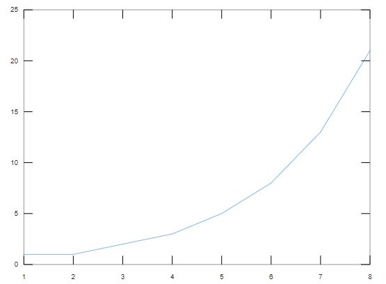
x = [0 0.1 0.2 0.3 0.4 0.5 0.6 0.7];plot(x,y)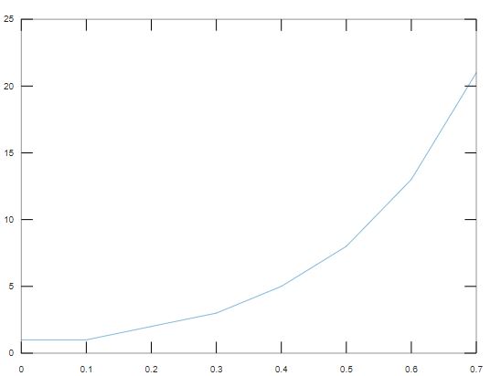
size(x)size(y)
ans =
   1   8

ans =
   1   8
plot([1 2 2], y), it's not going to work.
plot([1 2 2], y)
error: __plt2vv__: vector lengths must match
error: called from
    __plt__>__plt2vv__ at line 487 column 5
    __plt__>__plt2__ at line 247 column 14
    __plt__ at line 112 column 18
    plot at line 229 column 10
Line Graph
The next thing that we are going to do is a bit more complex, we are going to plot a function. One of the most useful functions that we need to learn is linspace. Linspace creates the range of values, so we pass in where we want it to start, where we want it to end, and how many points will be in between. So we are saying x is going to go from 0 to 100 and have 200 points in between.x = linspace(0,100,200);y = sin(x);plot(x,y)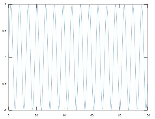
xx = linspace(0, 2*pi, 100);y = sin(x);plot(x,y);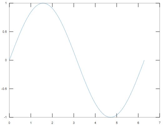
y2 = cos(x);plot(x, y, x, y2);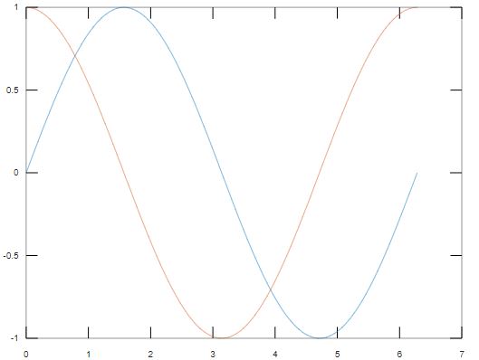
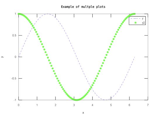
plot(x, y,'b--',x ,y2, 'g.');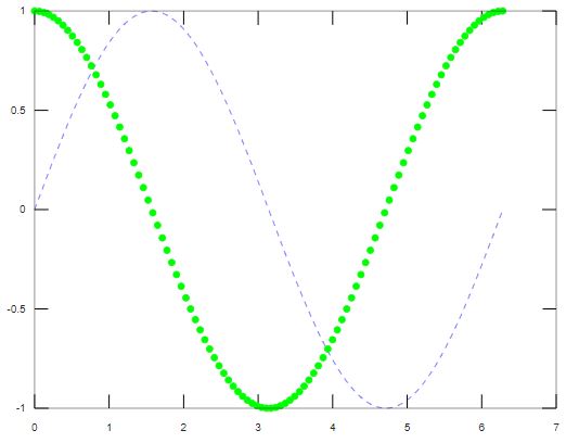
                            xlabel('x');
                            ylabel('y');
                            title('Example of multple plots');
                            legend('y', 'y2')
Line Graph with Error Bars
Error bar can be used to show the range of error at each point.x = 1:10:100;y = rand(1,10)*100;err = [2 8 10 4 5 6 3 9 2 7];errorbar(x,y,err)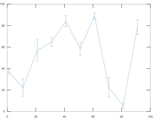
Bar Chart
Those were the default type of plots, there are other types as well. Like a bar plot. Let's see a simple example.x = 1:10
x =
    1    2    3    4    5    6    7    8    9   10
bar(x)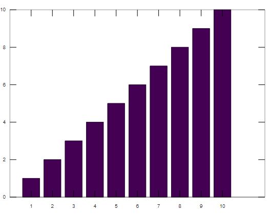
x = linspace(0, 2*pi, 100);y = sin(x);bar(x,y);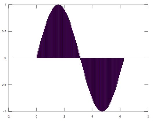
Histogram
The next useful plot is the histogram. If you have studied probability, you should be familiar with it. So with a given data set we might want to figure out what kind of distribution does it follow. Let's generate some data where we want to know the distribution. Like a thousand points that are normally distributed.x = rand(1000,1)plot(x);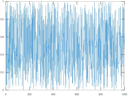
hist(x);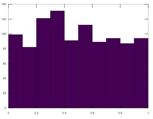
hist(x,50);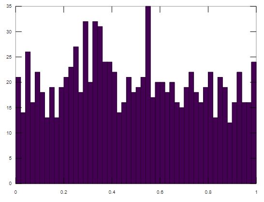
Pie Chart
Another plot type is a pie chart, which you probably have used in excel and powerpoint. Let's say x is 1 to 5.x = 1:5;pie(x);title("Example of a Pie Chart")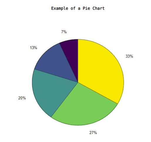
Scatter Plot
Another useful plot that we are going to see is the scatter plot. It is very useful and widely used in data analysis. Let's return to our sine example.x = linspace(0, 2*pi, 1000);y = 10 * sin(x) + rand(1,1000);plot(x,y);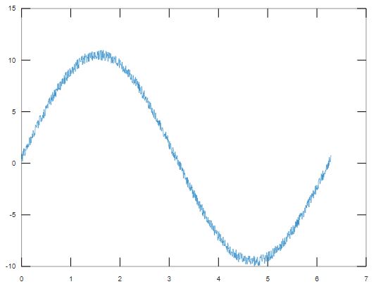
scatter(x,y)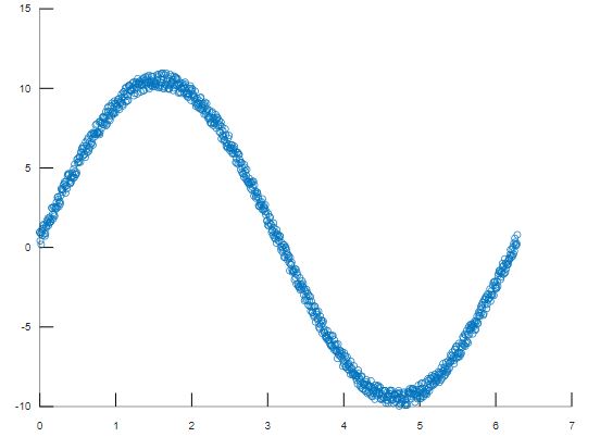
x = rand(1000,1) * 2;y = 5 * sin(x) + rand(1000,1);plot(x,y);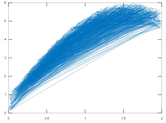
scatter(x,y);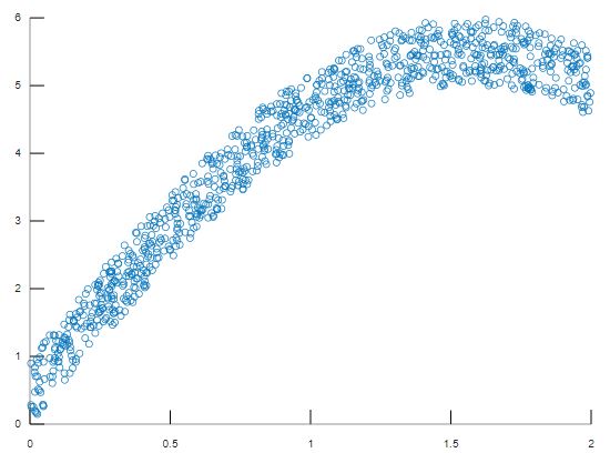
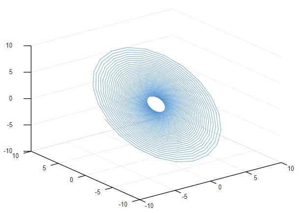
3D Plot
Beside 2D graphs, we can even plot things in 3D. Let's try to create a simple 3D line graph with the grid lines.m = 1:5;plot3(m,m,m);grid on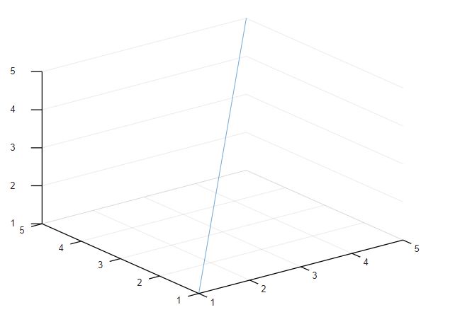
t = linspace(0,20,1000);x = exp(t./10).*sin(15*t);y = exp(t./10).*cos(15*t);plot3(x,y,y);grid on